Obvious works with founders and business leaders to transform complex ideas into clear, compelling brand value. They help organizations articulate what makes them different, define the messages that matter, and communicate that value with confidence. As a growing consulting firm, Obvious needed a brand that felt sharp, modern, and unmistakably strategic. They wanted something that reflected their clarity-driven process and the high level of thinking behind their work. The goal was to create an identity that felt bold yet approachable, giving the company a visual system that matched the precision and insight they bring to their clients.


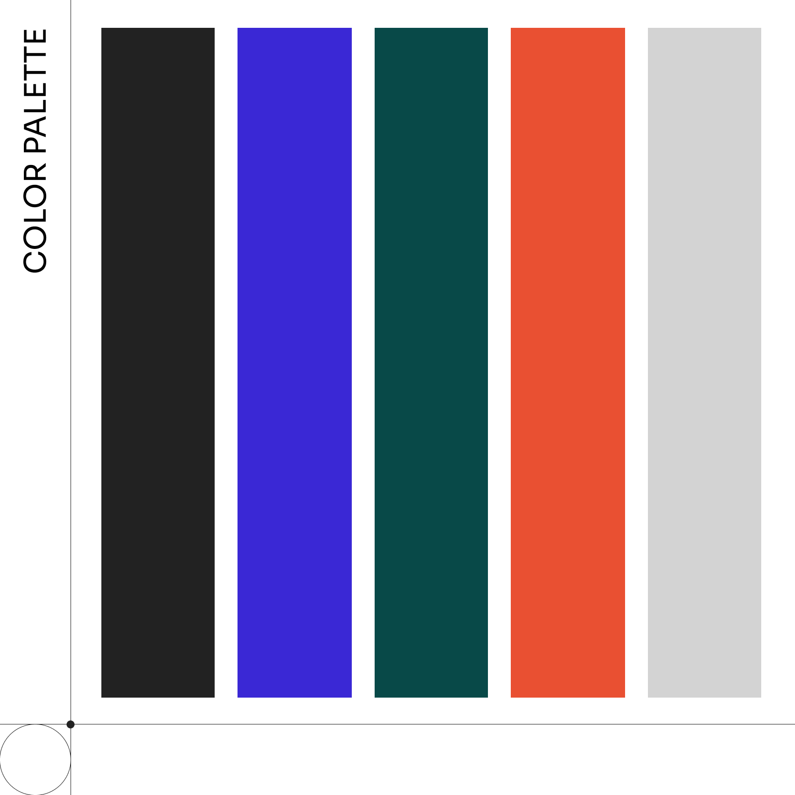
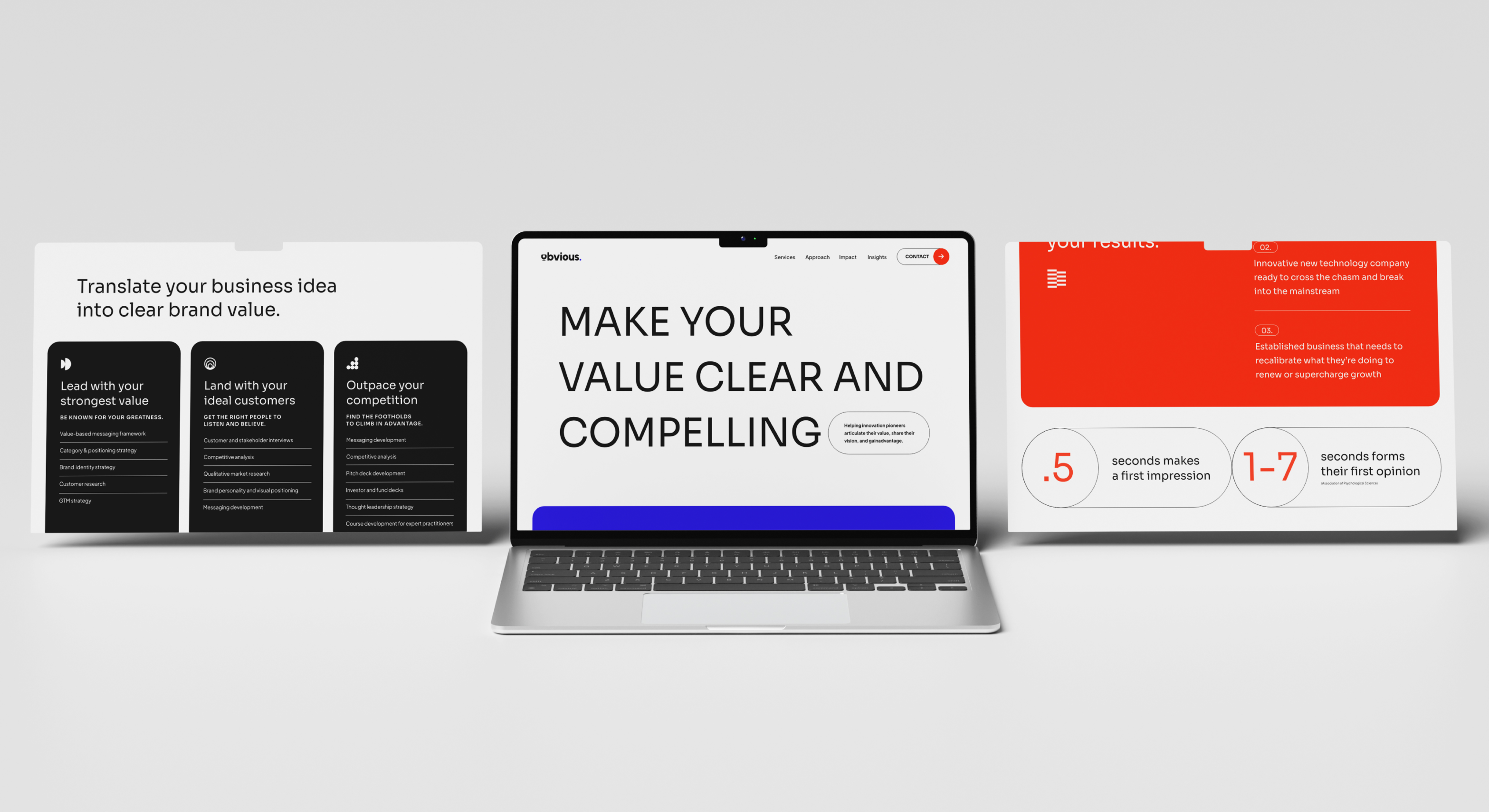
The visual identity for Obvious is built around clarity, momentum, and confident simplicity. The logomark introduces a sense of movement. Its curved forms and lifted baseline suggesting forward motion and the act of revealing or surfacing value. This sense of energy carries into the broader system through clean layouts that balance structured grids with the brand’s distinctive pill-shaped frame. The combination creates a flexible toolkit: sharp when it needs to be, soft when it benefits the message and always intentional. Bold typography, crisp spacing, and a vibrant electric blue bring focus and immediacy, resulting in a visual language that feels modern, direct, and unmistakably Obvious.


